
This report automates the creation of an Excel pivot table that accesses Mark Reporting data in the Q database. The pivot table displays the counts of marks awarded for each course offered, in a variety of ways, to provide extended data analysis and trend-spotting capabilities.
What is a pivot table?
An Excel pivot table is a three-dimensional, interactive spreadsheet that you can use to quickly summarize large amounts of data. You can rotate its rows and columns to cross-reference data. You can see different summaries of the source data, filter the data by displaying different pages, or display the details for areas of interest (drill-down). A pivot table is powerful tool that enables you to perform all kinds of calculations with your data and offers many ways to output the results of your calculations, including the creation of graphic charts, web pages, formatted reports, and delimited text files.
For detailed instructions on using a pivot table for data analysis, please refer to Microsoft Excel Online Help/Pivot Table reports.
While details specific to this report will follow, users can find general information about reports within the Reports documentation.
Marks Distribution Analysis Report is located within Reports in the Behavior menu in Q.
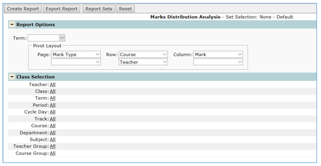
- Term: Select desired term to analysis the marks within the pivot table
- Pivot Layout: The report defaults with Page = Mark Type, Row = Course and Teacher with Column = Mark. These defaults can be changed before executing the report or within the pivot table.
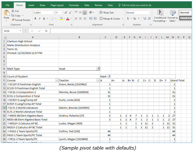
Analyze marks data
The pivot table accesses the Q Mark Reporting database and lists items of data across rows and down columns. The cells where the rows and columns intersect show summarized data in the form of Counts.
The pivot table displays the counts of each mark awarded for each course offered, per teacher, or the counts of marks awarded by each teacher, per course, depending on the Group by option selected. The mark type displayed globally can be selected using the drop-down list of the Mark Type field in the upper left corner of the spreadsheet. This is called a page filter. Further data analysis is accomplished by rearranging the table and applying various filters to get the desired results. This is done by dragging and dropping the field names to different regions in the table and selecting criteria from drop-down lists.
| Note: All marks that have ever been awarded in the selected term will be included for analysis in this pivot table - Marks that were awarded in course sections that were later closed to marks entry (by turning off the Assign Grades flag in their Section properties dialog in the Master Schedule Editor) will no longer appear. If there are such course sections in your database, it would be advisable to either clear out the marks it they should not be there, or turn the Assign Grades back on to see them in the Marks Distribution Analysis. |
Sample analysis
In the example illustrated above, the options on the launch screen used the default values and then manipulated within the pivot table.
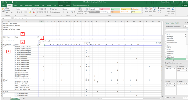
- The Mark Type was altered to ONLY include Academic mark types
- The default of Teacher field which was next to the Course was removed by unchecking the fields to add to report in the top right.
- The Genderc (Gender Code) was added by dragging it to the Field List and dropping in front of the Mark column header. This way the Total Count of each mark awarded is broken down (detailed) by gender.
- The Subject field was added to the data rows area by dragging it from the Field List.
Drill-down for details
To see the individual student records represented by a Count value in a cell, simply double-click on the target cell. This is called drill-down. A new worksheet will open (default name: 'Sheet1', 'Sheet2', etc.) displaying a roster with the queried student records.
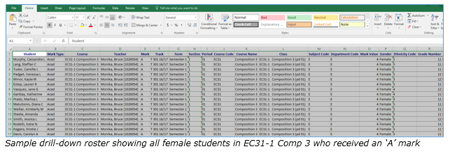
Records initially displayed in the drill-down are not sorted in any particular order. To select primary, secondary, and tertiary sorting fields, ascending or descending, select data in the spreadsheet and open the Sort dialog from the Data menu on the toolbar. Make sorting selections and click 'OK'.
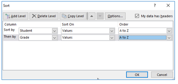
All other Excel capabilities are available to use on the drill-down results sheet, such as inserting and deleting columns, generating charts, applying formulas, etc.
To return to the home Pivot Table, click on Pivot Table sheet.
Refreshing data
Since your school data can change at any time, you may want to refresh the data in the Excel Pivot Table at a certain point. To refresh the data dynamically, click on the Create Report command button again. This will open a new Excel Pivot Table with the default name of 'Marks_Distribution_Analysis(2).xlsx, ‘Marks_Distribution_Analysis(3).xlsx’’, and so on. If any school data has changed it will be reflected in the new Pivot Table.